
Adding a UX Perspective to Drive Your Business’ Outcomes
BOAZ ROSSANO – SENIOR PRODUCT DESIGNER
I design the tools experts use when the stakes are real.
Deep-learning debugging platforms, GPU schedulers, drone ground-control stations. Products where the user is a specialist, the domain is unforgiving, and a confusing interface costs money, time, or an aircraft. My background is behavioural – I design around how people actually reason under pressure, not around the feature list.
Three decades
Product and interaction design, from ICQ to physical-AI tooling.
Bezalel & MBA
B.Des. Bezalel Academy · Executive MBA, University of Bradford
Teaching since 1996
Founded Shenkar's Interactive Design program; led Visual Communications at HIT
Psychology & UX
Head of the internship program, MTA College
(Ha'Academit Tel-Aviv Yafo)
Tensorleap
Product Designer & Product Lead · 6 years · Deep neural networks Explainability & Debugging.
THE PROBLEM
Data scientists could see that a model failed – never why. Training runs cost thousands in GPU time and ran for days, and no one could tell at hour six whether hour sixty was worth paying for. Debugging was instinct, followed by an expensive rerun.
THE INSIGHT
Data scientists are brilliant mathematicians who never picked up the working habits software engineers take for granted – branching, review, documentation, regression tests. So I didn't invent a collaboration model. I gave them Git's. Issues, pull requests and version control over experiments: patterns they'd absorbed by osmosis and could use without being taught.
WHAT I DESIGNED
A full platform redesign – experiment version control, six visualisation types replacing the old Kibana charts, n-dimensional cluster analysis, automated tests derived from any filter, and an Insights engine that names the failure in plain language: over-presentation, under-presentation, train/test leakage, with the correlated metadata attached.
THE OUTCOME
Tensorleap ships today as the quality layer for physical AI, used in robotics, autonomous vehicles, semiconductors, aerospace and healthcare. Publicly, Hexagon reports a 40% dataset reduction without sacrificing accuracy, and the platform reports up to 60% less labelling effort.

The Insights panel is the whole thesis. Rather than another chart, the platform writes the diagnosis – "cluster of 215 samples found with +20% loss in average," correlated to lower sky-class metadata. One click turns it into an Issue: the Git metaphor doing real work.

Training runs for days, so notifications carry the state a user missed while away. Severity is colour-coded and each item routes straight to the offending code.

Comparing two runs – or two epochs of one run – as linked scatter fields, so picking the best checkpoint is a visual judgement rather than a spreadsheet exercise.
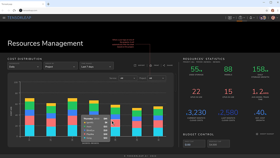
The commercial layer – cost per project, GPU and storage statistics, hard daily and monthly caps. The fear I kept hearing in interviews wasn't "will this model train," it was "what will this month cost."
The Git metaphor, made literal version control over experiments

The left rail is a branch graph, not a list. Experiments fork, run in parallel and merge – drawn with the same coloured lines a developer already reads in a Git client. Along the top, a six-step setup bar (Model, Code, Inputs, Loss, Metrics, Vis) turns an intimidating configuration into a checklist you can leave and come back to.
Where code meets canvas the hardest problem on the project

Data scientists write Python; the platform draws a graph. Both are the same model, and either can drift. So the mapping is editable as code and readable as a table, and when the two disagree the interface says so plainly and offers the only two honest choices – Update from map or Apply to map. No silent merge. Deciding what happens when two sources of truth conflict was the hardest interaction problem on the project.

Naming the failure modes was design work in itself. Over-fit, high loss, under- and over-presentation, data leakage – each counted, each clickable, each with a recommended action rather than just a warning.

Every team watches different things, so the dashboard is composable – dashlets drag, duplicate and filter independently. One layout could never have fitted a radiologist and an autonomous-driving team both.

Two models, same sample, side by side – with the confidence threshold as a live slider so you can watch predictions appear and vanish. Comparison is the core act of debugging, so it's a first-class layout rather than two browser tabs.
SIX YEARS, ACROSS
-
Onboarding & activation
A six-step guided setup and a freemium conversion funnel
-
Data visualisation
Six chart types built to replace Kibana, plus n-dimensional cluster views
-
Collaboration
Issues, pull requests and shared experiment history
-
Developer experience
Code editor, dataset mapping, integrations library, LeapHub
-
Commercial & billing
Budget caps, cost attribution, storage and compute limits
-
Team administration
Profiles, self-managed teams, roles and permissions
run:ai
Consulting Product Designer · two years · designed the product from zero – there was no UI before I started
THE PROBLEM
Organisations were buying enormous GPU capacity and using a fraction of it. Jobs queued while cards sat idle, no one could see where the waste was, and the people signing the invoices had no view into whether any of it was working.
THE INSIGHT
An infrastructure tool is renewed by a budget holder, not by the engineer using it. The engineer already knows the scheduler helps; the person paying does not. So I pushed the founders to put the money saved on the wall – not utilisation as a percentage, but dollars, in green, above everything else.
WHAT I DESIGNED
The full scheduler web app, anchored by a long-term dashboard that reads as a financial statement rather than a telemetry dump. Every tile pairs the current period against the previous one, and the analytics beneath explain the number – underused capacity, overrun budgets, wait time by project.
THE OUTCOME
Nvidia acquired Run:ai in December 2024 for a reported $700M. I'd finished years earlier and make no claim on the deal – but the product Nvidia bought is recognisably the one I designed, minorly restyled, rather than rebuilt.

Six tiles, and the last one is the argument. Average GPU utilisation, on-premise cost, cloud spend, run time, wait time – then Money Saved by Run:ai, $62,400. That tile is the renewal conversation, designed into the product.

The operational view underneath: what's running, what's waiting, whose it is.

Allocation and quota, expressed in teams and projects rather than nodes.
The other audience the IT manager who owns the hardware

The same product serves a second user with an opposite question. The researcher asks "when does my job run"; the IT manager asks "which box is idle and which one is down." So the node view leads with status and a single utilisation gauge – 51% on this machine – before any chart.
Two audiences, one product, different first screens.
FlightOps
Product Designer · operator console for dual-use drone remote presence and mission control
THE PROBLEM
Flying an aircraft you cannot see, over a link that may drop, on a battery that will run out. Operators range from police monitoring a facility breach to university researchers – and the person at the site is often not the person at the controls in HQ.
THE INSIGHT
In teleoperation the dangerous moment isn't failure, it's ambiguity about whether something has failed. An operator who can't tell a frozen video feed from a hovering aircraft will make the wrong call. So flight-critical state – link, battery, altitude, speed – stays permanently on screen at a glance. Never nested, never inferred.
WHAT I DESIGNED
A single-screen ground station: live camera at full bleed, satellite map with aircraft position alongside, gimbal and zoom in a fixed rail, and a persistent telemetry strip. The three irreversible actions – Enable Drone, Return Home, Stop Mission – are grouped, colour-separated and deliberately placed away from routine controls.
THE OUTCOME
The platform operates at scale across logistics, public safety, defence and inspection. FlightOps reports 90,000 operational flight missions in 2023 and roughly 1,000 autonomous flight hours a month, flown with customers worldwide.

Nothing critical is more than one glance away. Battery at 84% with signal strength beside it, speed and three altitude references, and the abort group – Return Home, Stop Mission – held apart from everything routine.
Two themes, because the room changes light and dark builds of the same console

The same console ships light and dark, and that isn't a preference setting – it's where the operator is standing. In a vehicle or a field position in Israeli daylight, a dark interface is unreadable behind screen glare; in a dim operations room at night, a white one destroys the night adaptation an operator needs to look up from the screen. Compare the rail here with the dark build above: identical structure, inverted surface. Note also that yaw and pitch are dials showing current attitude, not sliders you set blind, so the operator can read where the camera points without moving it.
DESIGNED FOR
-
Two operator roles
The person on site and the person at HQ, often not the same
-
Degraded conditions
Link loss, low battery, and the aircraft's own fallback behaviour
-
Dual use
Police and security alongside civil and academic operators
-
Irreversible actions
Enable, Return Home and Stop Mission, separated by design
-
Two lighting environments
Light and dark builds for field daylight and the night operations room
Sponserim
Product Designer · two-sided sponsorship marketplace · the company didn't close its round, and the product never shipped
THE PROBLEM
Sponsorship matching runs on personal networks, so small clubs and causes never reach the brands that would fund them, and brand managers field a stream of pitches that don't fit. Both sides waste the same conversation repeatedly.
THE INSIGHT
Every marketplace has a hard side, and here it's the sponsors – money is scarce, people seeking money are not. So the product is built around the brand manager's workflow, not the seeker's. And the match score isn't audience fit, it's values fit: a cigarette brand cannot sponsor a children's football club, and surfacing that early prevents the meeting that was never going to happen.
WHAT I DESIGNED
A pipeline the sponsor already understands – a drag-and-drop leads funnel borrowed from CRM, with money totalled per stage so the brand manager watches committed spend move. Match confidence sits on every card, and a Non-Relevant column makes rejection a single gesture rather than an unanswered email.
THE OUTCOME
None, and I'd rather say so.
The round didn't close and the marketplace never went live. The work stands as design reasoning about two-sided liquidity and value alignment – not as a product with users.

Welcome users back to the app - there's no 'downtime': Instead of making them remember their password, why not take that login moment to share what's new on the platform, highlight interesting updates about their colleagues, and present fresh sponsorship opportunities that have just become available?
Making "values fit" something you can actually see the match panel

A score nobody understands is a score nobody trusts. So the drawer doesn't show 95% and stop – it shows the working: matched 5 out of 10, then brand-values matches listed one by one, location, and timing. The sponsor can disagree with a specific line rather than dismissing the whole number, which is the difference between a recommendation engine people use and one they ignore.
The other side of the market the organisation raising money

The seeker's dashboard answers a different question – not "who should I approach" but "will this event actually be funded in time." The funnel counts sit beside a calendar that flags under-funded events, and the income chart plots committed money against a dotted goal outline with a NOW marker cutting through it. You can see the shortfall before it becomes one.

Brands are browsed the way the matching works – every card leads with Our Values, then budget range and capacity. Filters run on tags, demographics, time, location and budget. The same vocabulary the algorithm uses is the vocabulary the user reads, so the score never feels arbitrary.
A FULL TWO-SIDED MARKETPLACE, DESIGNED END TO END
-
Sponsor side
Opportunity discovery, filtering, match explanation, budget tracking
-
Seeker side
Fundraising dashboard, funnel forecasting, under-funding alerts
-
The matching layer
Values-based scoring, made legible rather than magical
-
Pipeline management
Drag-and-drop CRM funnel with money totalled per stage
-
Notifications
New-match alerts and account-manager recommendations
-
Content
An industry news feed to give both sides a reason to return
WHERE THE WORK ENDED UP?
Over $7B
Companies I've designed for have since been acquired or gone public, and their exits now total more than $7 billion – among them Run:ai (Nvidia), ClickSoftware (Salesforce), Cyvera (Palo Alto Networks), M-Systems (SanDisk), XIV (IBM), Qumranet (Red Hat), Comverse (Verint), Orca Interactive (France Telecom)...
I designed the products; the outcomes were theirs.
Selected clients across three decades: Salesforce, BMC Software, NetApp, Amdocs, Fundtech, SanDisk, Verint, Israel Aerospace Industries, RadVision, Palo Alto Networks, Clarivate, ICQ, Nvidia, ThetaRay, Bezeq, HOT, Powtoon, France Telecom, Flash Networks, Insuline Medical, Cellcom, Discount Bank, ...

Why the thinking looks like this
I came up through Bezalel and an Executive MBA, founded and ran Shenkar's Interactive Design program, led Visual Communications at HIT, and built Tribal DDB – Israel's first digital advertising agency.
I've been teaching since 1996, and I currently head the internship program in Psychology & UX at MTA College.
That last one explains the rest. I read products as behaviour: what a user believes is happening, what they fear, and which habit they'll fall back on when the screen gets hard. Every case above turns on that, not on the visual layer.
Want to see more projects? Check out our Older Portfolio Samples...